Most people assume the photographer handles everything on shoot day. To a degree, that’s true. Our crew walks onto every set ready to adjust, finesse, and problem-solve until every frame is right. But after 30+ years of shooting for brands like Camden Living, David Weekley Homes, and Minto Communities, here’s what we’ve learned: the difference between a good shoot and a great one usually comes down to how well the space was prepared before we arrive.
This article walks through the staging details we look for on every interior shoot. Whether you’re a marketing director coordinating a property shoot, an interior designer prepping a model, or a property manager getting a space camera-ready for the first time, these tips will help you understand what we’re looking at, why it matters, and how to set the stage for the best possible results.
For a broader look at the full process, from planning through post-production, start with our complete guide to architectural photography.
Start With the Big Picture
Before you touch a single pillow, step back and look at the room the way the camera will. This step gets skipped a lot, and it shouldn’t.
Walk the space and figure out the likely shooting angles. Stand where the camera could go and look at the scene through that lens. What’s in the background? What’s competing for attention? What story is this room supposed to tell? Every room has a hero angle, the primary composition that’s going to do the heavy lifting in your marketing. Find that angle first and work backward from there.
From that vantage point, start removing anything that doesn’t serve the shot. Personal items, visible cords and cables, temporary signage, extra furniture that crowds the composition, random objects that found their way onto a shelf. All of it has to go. You want a clean, deliberate frame where the eye moves through the space without snagging on something that doesn’t belong.
Here’s the thing: in person, your eye skips over clutter because your brain filters it out. A camera doesn’t do that. Everything in the frame carries equal weight, so anything that doesn’t contribute is actively pulling focus.
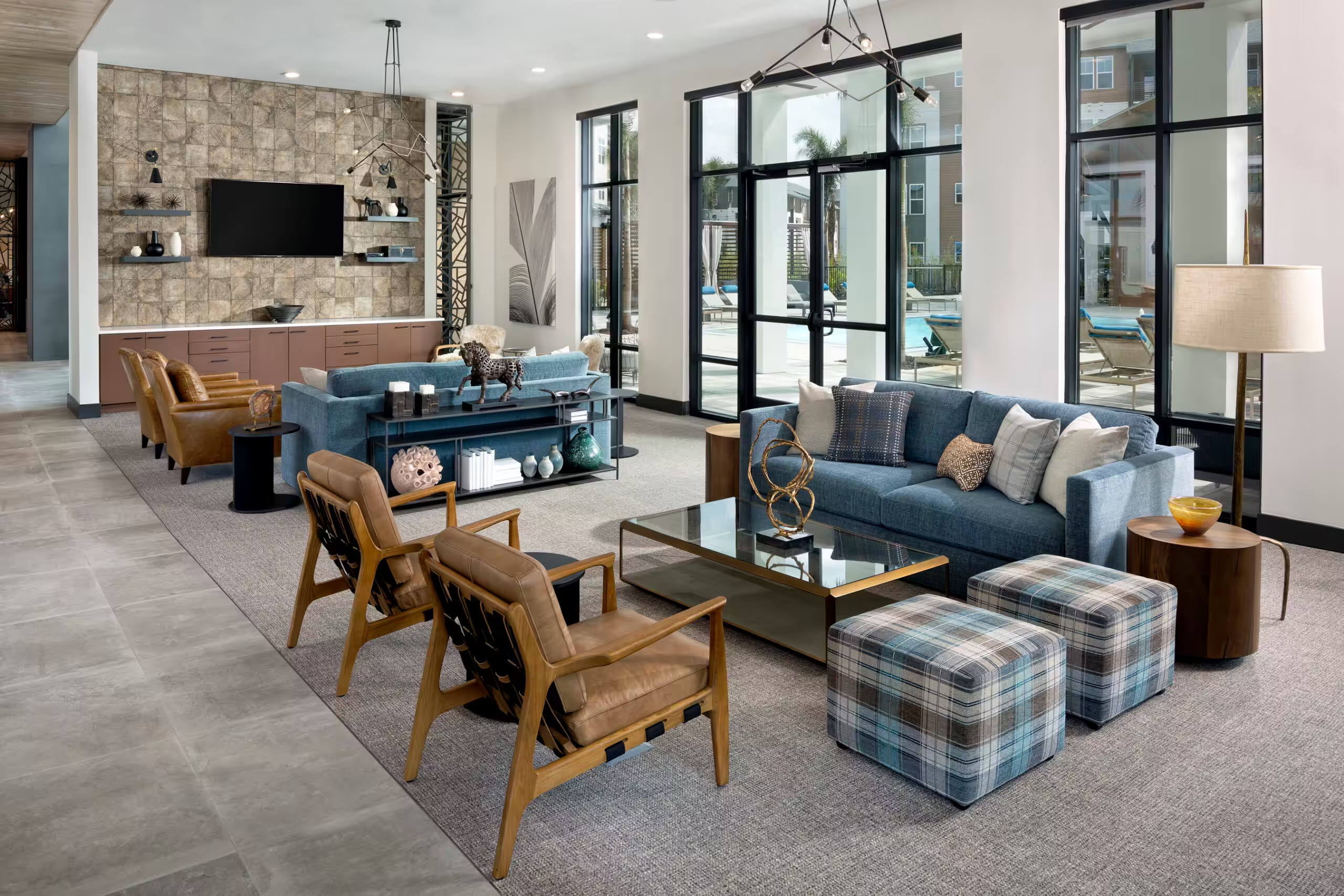
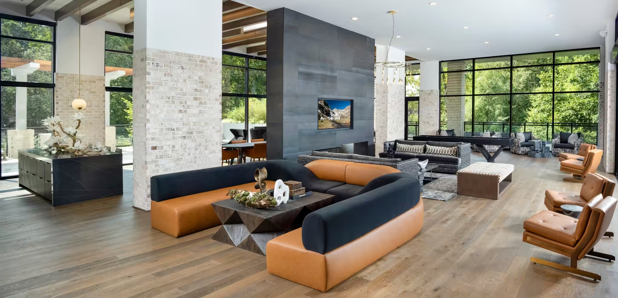
Furniture Placement: Yes, Fractions of an Inch Matter
This is where the detail obsession kicks in, and it’s one of the things that separates a premium architectural shoot from everything else.
Furniture should line up with the architecture of the room: walls, countertops, window frames, tile patterns. A slight angle that looks fine in person can read as sloppy in a still photograph. The camera picks up on misalignment in a way the human eye tends to forgive, so what looks “close enough” to you in the room can look noticeably off in the final shot.
Symmetry follows the same rule. If two chairs flank a fireplace, they need to be evenly spaced. If a dining table sits under a pendant light, it needs to be centered, not almost centered. We routinely move furniture by a fraction of an inch on set because we know the difference shows up in the photograph. It might seem excessive in the moment. It never looks excessive in the final result.
A few more furniture tips that make a visible difference. Pull seating slightly away from walls to create depth and avoid that flat, pushed-back look. Angle dining chairs and bar stools with purpose instead of leaving them however they landed. And if a room has a rug, make sure the furniture sits on it in a balanced way. Half-on, half-off can look accidental on camera.
Textiles and Soft Details
Pillows, throws, rugs, towels, bed linens. These are the details that separate a properly staged photograph from a snapshot. They’re also the details most people rush through because they seem minor. They’re not.
Start with pillows. Fluff them so they look full, not deflated and forgotten. If you’re going for that crisp, styled look, a karate chop down the center gives them shape and dimension. Arrange them with purpose. Vary sizes, stagger positions, and don’t line them up like soldiers.
Throws and blankets should be draped with intent. A casually tossed throw can add warmth to a shot, but there’s a real difference between “stylishly casual” and “actually messy.” Fold or drape thoughtfully and watch for bunching or awkward creasing.
Rugs are a detail most people miss entirely. Vacuum or sweep them so the nap runs in one consistent direction. This actually matters in photographs, because a rug with foot traffic patterns or an uneven surface can read as patchy or dirty, even when it’s perfectly clean.
In bathrooms and kitchens, towels should be freshly folded and evenly hung. No bunching, no wrinkles, no towels that look like someone just used them. If the design calls for rolled towels on a shelf or in a basket, make sure they’re uniform in size and tightly rolled.
Countertops, Surfaces, and Styling
Every flat surface in the frame is either a distraction or an asset. There’s no in-between. Style them with purpose so they add to the composition instead of pulling focus.
Kitchen countertops should be cleared of nearly everything. A few well-chosen props, a cutting board, a small plant, a clean bowl of fruit, a design-forward kettle, can add life and warmth without crossing into clutter. Toasters, coffee makers, and blenders should come off the counter unless they’re a deliberate design feature. Same goes for dish soap, paper towel holders, knife blocks, and anything strictly utilitarian.
Bathroom counters follow the same principle with even less margin for error. One or two curated items, a quality soap dispenser, a small potted succulent, a neatly folded hand towel, and that’s it. Toothbrushes, products, and daily-use items need to disappear.
For coffee tables, side tables, and console surfaces, style in odd numbers. One item or three reads as intentional. Two reads as unfinished, and four or more starts to feel cluttered. Vary heights, a stack of books with a small object on top, a vase next to a candle, and keep everything scaled to the surface it’s on.
Across every surface in the space, remove the personal stuff: loose mail, remote controls, phone chargers, water bottles, brand-specific clutter, anything that pulls the eye away from the architecture and design. If it didn’t come from the designer, it probably shouldn’t be in the shot.
Windows, Light, and Reflections
Natural light is one of the most valuable elements in interior photography, but unmanaged windows can create real problems. A few things to check before the shoot.
Clean all visible glass. Fingerprints, smudges, and water spots that are invisible to the naked eye become glaringly obvious in a high-resolution photograph, especially with light streaming through. That includes sliding glass doors, French doors, and any interior glass.
Open blinds and curtains evenly. Sounds obvious, but uneven blinds are hands-down one of the most common staging oversights we run into on set. If a room has multiple windows, every set of blinds should be raised to the same height, and every curtain panel should hang uniformly. The camera catches an inconsistency that you won’t notice standing in the room.
Check for reflections. Mirrors, glass tabletops, TV screens, polished countertops, and stainless steel appliances all act as potential reflectors. They can pick up the camera, the lighting equipment, the crew, or even a window view that pulls attention away from the room itself. Our team handles reflections on set, but flagging the obvious ones in advance, especially large mirrors and dark TV screens, saves time and keeps the shoot moving.
And if the window views are a selling point for the space, make sure nothing is blocking them. Furniture pushed against the glass, oversized plants on the sill, or decor crowding the window frame all undercut what should be one of the room’s strongest features.
The Final Walk-Through Checklist
The day before your shoot, walk through the space one last time with this checklist. It covers the details that make the biggest difference on camera.
- All lights working. Replace burned-out bulbs and match color temperatures across fixtures.
- Floors clean. Vacuumed, mopped, and free of scuff marks or debris.
- Personal items and daily-use clutter removed from every room.
- Furniture squared to the walls and architectural lines.
- Pillows fluffed and textiles smoothed, straightened, and wrinkle-free.
- Countertops and surfaces styled with minimal, well-chosen props.
- All glass surfaces cleaned. Windows, mirrors, glass doors, tabletops.
- Blinds and curtains open, even, and uniform across all windows.
- Reflective surfaces checked for visible equipment or crew reflections.
- Trash cans emptied and tucked out of sight.
- Outdoor areas tidied if they’re visible from interior shots or included in the scope.
For a more detailed version you can share with your team, check out our client’s pre-shoot checklist for architectural photography.
Great Staging and Great Photography Are a Team Effort
The best results happen when the space is prepared with the same care that goes into the photography. The more camera-ready the environment, the more time our crew can spend on the creative work that actually makes the photographs outstanding: the lighting, composition, and small details that turn a well-designed room into a shot that holds the gaze.
Planning an interior shoot and want to make sure everything goes smoothly? Reach out to the Rob-Harris Productions team and let’s get it on the calendar.
And if you haven’t already, take a look at our complete guide to architectural photography for the full picture of what goes into a premium shoot from start to finish.